Will Stamper’s Blog
Creating a Custom Flair Stylesheet for Reddit
October 4, 2013
10/13 Update: r/cfb seems to have changed its stylesheet in a way which breaks my overrides :( I made a couple of changes that should help a bit, but it looks like comment flair is still borked. If I have a bit of spare time later, I may look into what’s causing that, but for now, this project is mostly broken. Sorry folks. The writeup is still fairly interesting.
I frequent r/cfb, a subreddit that is based around college football. Every user on that subreddit has a piece of flair attached to their username that shows their fandom. Each piece of flair is a 20x20 image. I decided that this was too small, especially for some of the more complex logos, and I decided to replace them with more suitable icons.
Investigation
I started out by looking at how flair works in general. Basically, each piece of flair has a different class, and the stylesheet for the subreddit has styles that use background-position to pick the correct icon off the stylesheet. Unfortunately, that makes it impossible to use the default stylesheet for larger icons. Based on comments from the moderators, I figured out that they mainly pulled the icons from a CDN on ESPN.com.
Continuing my investigation, I started to look into the structure of ESPN’s icon CDN. As far as I could tell, there is no predictable pattern whatsoever in how the icons are numbered. It starts out going in alphabetical order by state, but then switches to (somewhat) alphabetical order by name. Not every ID is used, and sometimes a huge range of IDs will be unused. In a lucky break, it proved possible to go from the image, located at http://a.espncdn.com/combiner/i?img=/i/teamlogos/ncaa/500/NUMERICIDGOESHERE.png?w=80&h=80&transparent=true, to the page for the team, located at http://espn.go.com/college-football/team/_/id/NUMERICIDGOESHERE. I figured that this would allow me to pull in the team name fairly easily.
Getting It Working
I decided to loop over all IDs between 1 and 5000, since that seemed like a reasonable maximum. I used cURL to pull down the HTML for each page, one by one. For each page, I would test to see if it was a full page or an error. If it was a full page, I would filter the title of the page using sed to produce an string that was all lowercase without spaces or punctuation, matching the class names used on the subreddit. From there, I just output the styles to the end of a file, substituting in the correct background-image url. Running the script took approximately 30 minutes, limited mainly by waiting for error responses from non-existent pages that I was checking for. You can see the script that I used below.
rm -f list2.txt
touch list2.txt
for test in {5001..8000}
do
  curl -silent http://espn.go.com/college-football/team/_/id/$test > temp.txt
  count=`wc -l < temp.txt`
  if [ "$count" -gt 10 ]
  then
    lower=`cat temp.txt | sed -n '35,35p' | sed -e 's/<title>//g' -e 's/ Football - .* News, Scores, Videos - College Football - ESPN<\/title>//g' -e 's/ //g' -e 's/&//g' -e 's/-//g' -e 's/(//g' -e 's/)//g' -e 's/\.//g' | tr '[:upper:]' '[:lower:]'`
    echo $lower
    echo ".flair-$lower {" >> list2.txt
    echo "background-image: url('http://a.espncdn.com/combiner/i?img=/i/teamlogos/ncaa/500/$test.png?w=80&h=80&transparent=true') !important;" >> list2.txt
    echo "background-position: 0 0 !important;" >> list2.txt
    echo "background-size: 30px 30px !important;" >> list2.txt
    echo "width: 30px !important;" >> list2.txt
    echo "height: 30px !important;" >> list2.txt
    echo "}" >> list2.txt
    echo ".flair-$lower:hover {" >> list2.txt
    echo "background-image: none !important" >> list2.txt;
    echo "width: auto !important" >> list2.txt;
    echo "height: auto !important" >> list2.txt;
    echo "}" >> list2.txt;
  fi
done
rm temp.txt
It’s certainly not the most efficient or concise version it could possibly be. However, the curl operations are by far the limiting factor on speed, so the gains from optimizing the text generation would be minimal.
The Results
My first though was to use this style in Stylish, which is basically Greasemonkey for CSS. However, I was having some weird issues where rendering any page would take about 50% of my processor after installing Stylish. That was unusual, so I opted for a different approach. I placed the newly generated css into my userContent.css file, which had the same effect, but it opened the possibility of clobbering the styles on some other sites. I don’t think that it will prove to be a significant issue, so we’ll see how that goes.
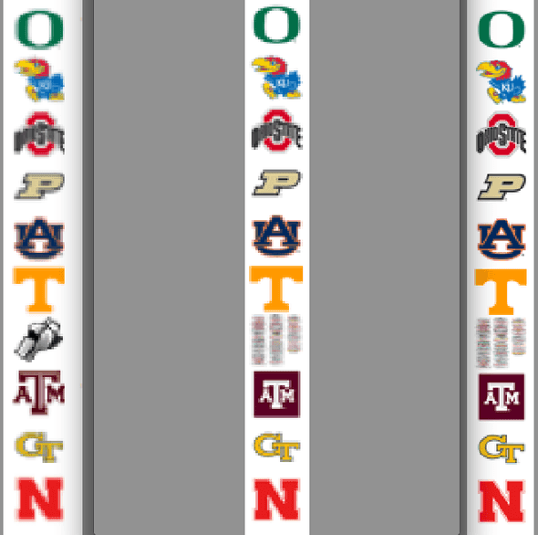
Once I got the styles loading, I was fairly impressed with the results. The new icons are much clearer at a 30x30 size, and even at a 20x20 size, the clarity of the icons was significantly improved. Performance suffered no noticeable degradation, so that’s a bonus. You can see a comparison of the icons below.
Left: Original icons. Middle: 20x20 new icons. Right: 30x30 new icons.
I posted the stylesheet to Github, and to r/cfb, where they were positively received. Overall, I’m pretty satisfied with my new icons, and I’ll continue to use them in the future.
